
My Role
Design Ops
Timeline
Q4 2025
Key Deliverables
Figma Friction Matrix, Component Prioritization Roadmap
Skills
Design System Analytics, Quantitative UX Research, Strategic Prioritization
Tools
API Integration, Figma, Python, Power BI, Excel
Overcoming the Limits of Native Analytics
When the Dayforce design team upgraded to a Figma Enterprise license, we unlocked native analytics. Gaining access to Figma Enterprise analytics was a great first step, but I quickly hit a wall.
The native dashboard offered high-level trends but lacked the granular data required to measure true system health. Specifically, I couldn't clearly see the relationship between how often a component was used versus how often it was detached.

Figma’s native analytics dashboard was not sufficient to analyze system health.
Bridging the Data Gap with Python
To move past simple vanity metrics, I needed raw data. By leveraging Python to ping the Figma REST API, I built a custom data extraction pipeline.
The Goal
Pull raw, unaggregated data on component insertions and detachments over a one-year period.

Extracting raw data from the Figma API using Python.
The Output
This gave me the exact raw inputs necessary to calculate true failure rates, setting the stage for a highly targeted investigation.

The extracted data from Figma using Python.
I started questioning the validity of our year-to-date metrics
When I first visualized the raw analytics in Power BI, my immediate thought was, "The system is failing everywhere." I presented these initial numbers, but my manager's skepticism posed a critical question: "Is this real friction, or just jamming?"

Visualized the raw data using Power BI.
The initial view included unfiltered data, including the significant statistical noise found in detachment prior to refinement.
Hypothesis
High detachment numbers indicate that specific components (e.g., Cards and Headers) are failing designers, forcing them to break the system to customize their designs.

Key Questions to Answer
Is the data skewed by teams doing non-product work (Marketing/Ideation)?
After removing the noise, which components are actually failing?
Distinguishing “creative jamming” from systemic friction
To validate the problem, I needed to distinguish between “Good Detachment” (Creative Jamming) and “Bad Detachment” (User Friction).
The Outlier Analysis

I began by grouping the data by team to see where the breaks were happening. One team immediately stood out: the Creative Studio team had a massive detachment rate.
Validating User Intent within the outlier (Creative Studio team)

To understand if this outlier represented a system failure, I audited the file logs for the Creative Studio team. The metadata revealed the context: the top files were named “Design Ideation,” “Playground,” and “Testing” .
This confirmed that the high detachment rate was driven by intentional design exploration (creating marketing assets), not an inability to use the system for UI. This was data noise. The Creative Studio team was excluded from further investigation for detachment rate analysis.
The Friction Matrix
With the non-product noise filtered out, I needed a way to visualize the remaining product data to find the real broken components.
1. Plotting the Matrix
I created a Scatter Plot to visualize the relationship between Popularity (Insertion Volume) and Friction (Detachment Rate).
X-Axis: Sum of Insertions (Volume).
Y-Axis: Average Monthly Detachment Rate (Friction).
2. Refining the Filter
I noticed significant clutter from rarely used components (the left side of the chart). I applied a second filter to exclude components with <100 Insertions. This ensured we only focused on statistically significant failures, not one-off experiments.
3. Isolating Systemic Patterns
Two clear problem points appeared in the top-right quadrant (High Usage + High Friction):
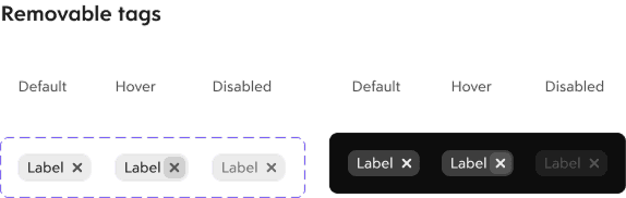
Removable Tag Group: The most fragile component (Highest Y-axis position).
Checkbox: The highest-impact pain point (High Volume + High Friction).

Heavily used and heavily detached: the top-right quadrant of the matrix, where friction costs the most.

Presenting the three-chart story to leadership
The final report walked leadership through the investigation as a three-chart story: the Suspect (detachment rate by team), the Alibi (Creative Studio’s file logs), and the Culprit (the friction matrix).
One narrative did what raw dashboards couldn’t: it turned a contested metric into a clear decision.
What the report changed:
Validated the noise: The detachment spike traced to Creative Studio’s motion and marketing work: a 23% detachment rate against a company average near 1%. The system wasn’t crumbling; it was being used for creative exploration.
Named the real problems: The Checkbox, the highest-impact pain point (high volume + high friction, concentrated in Platform Services), and the Removable Tag Group, the most fragile component in production.
Reframed the metric: “Total detachments” gave way to detachment rate with a >100-insertion threshold, the number the team now tracks instead of raw counts.
And the roadmap it set in motion:
Immediate: Audit the Checkbox’s component structure. The failure pattern points to a missing indeterminate (“mixed”) state.
Outreach: Targeted qualitative interviews with Platform Services, our heaviest Checkbox users. My data gave the Design System team its interview shortlist.
Long-term: A monthly design-system health check that excludes the Creative Studio workspace, so the signal stays clean.
How the final report walked leadership from suspicion to signal
CHART A
The Suspect
Detachment rate by team. One outlier jumped out: Creative Studio at 23%, against a company average near 1%.
Flagged the outlier
→
CHART B
The Alibi
File logs from the Creative Studio workspace: “Motion Guide,” “Video AI,” “Illustration Playground.” Creative work, not product UI.
Cleared the noise
→
CHART C
The Culprit
The friction matrix, usage against detachment rate. Two components sat alone in the high-usage, high-friction quadrant.
Named the real failures
The final report told the investigation as a story: each chart answered the question the previous one raised.
What the report set in motion
IMMEDIATE
Checkbox audit
A structural review of the Checkbox, targeting the missing indeterminate (“mixed”) state.
Owner: Design System team
OUTREACH
Platform Services interviews
Qualitative sessions with our heaviest Checkbox users, shortlisted directly from the data.
Owner: Design System team
LONG-TERM
Monthly health check
A recurring detachment-rate review that excludes the Creative Studio workspace, keeping the signal clean.
Owner: Design Ops
Three horizons: fix the component, learn from its users, keep the data trustworthy.
What this project taught me
Three lessons I’m carrying into the next audit.
The raw numbers lied. Total detachment counts painted a system failing everywhere; rates, thresholds, and file-level context told the truth. Metrics are just numbers until you open the files behind them.
Learning that Creative Studio detaches components to make motion graphics reframed the entire dataset. Usage analytics can’t be read apart from the people generating them and the kind of work they do.
Not every detachment is a failure. Some are exploration; some are limitation. The job of design-system analytics is telling the two apart and only fixing the second.
The distinction behind every decision in this project
JAMMING
Exploration
Components detached on purpose: motion tests, marketing assets, playground files. The system being stretched, not failing.
Response: filter it out of the metric
BREAKING
Limitation
Components detached out of necessity in production UI. A signal that a component no longer fits real workflows.
Response: fix the component
The split that turned raw detachment counts into a usable health metric.
Next Project

TVO CMS Internal Tool Productivity Upgrade
Redesigned content management workflows for TVO’s Product Team.