
As the sole designer, I launched Lintier Jewellery's first responsive e-commerce site. Post-launch, the site attracted traffic but generated zero sales.
I quickly diagnosed a critical friction point in the checkout process . My targeted UX fix generated the brand's first-ever online sale within two weeks, helping them achieve their $10,000 revenue goal.
My Role
Product Designer
Timeline
8 Months
Key Deliverables
E-commerce Website (UX/UI), Promotional Video, Email Campaign
Skills
Product Design, Behavioral Analytics, Digital Marketing, Content Creation,
Brand Storytelling
The Challenge
An e-commerce website with zero conversions.

Discovery
Pinpointing the 0% conversion rate.
Using Microsoft Clarity, I diagnosed the initial problem. During the testing period, the data showed that the site was getting traffic (1,237 users) and purchase intent (22 users added to cart), but the conversion rate was 0%.
The core question became: “What is causing 100% of potential customers to drop off?”

Research
Defining the “Where,” “Who,” and “Why” of the problem.
Diagnosing the $0 sales problem, my goal was to move beyond assumptions and use a data-driven process. My research followed a funnel, starting with broad analytics and narrowing down to specific user behaviors.
Quantitative Analysis
Finding the “Where” and “Who”
The Problem: Out of 1,237 users, 22 added items to their cart, but 0 completed a purchase.
The Audience: 50% of all users were on an iOS mobile device, making them the largest and most critical user segment.
Key Insight: The conversion failure was not random; it was a specific issue happening on the final checkout page and primarily affecting our largest audience segment.

Qualitative Analysis
Uncovering the “Why”
Method 1: Heatmap Analysis
Heatmap analysis revealed that users actively interacted with shipping/billing fields but almost completely ignored the primary “Shop Pay” button.

Method 2: Session Recording Analysis
Watching session recordings provided the “Aha!” moment. iOS users would tap “Shop Pay,” get prompted to create an account, hesitate, and then abandon their cart.
Design & Solution
High-Impact, Low-Effort Fix
The research clearly showed that a single button was the primary cause of failure. The solution didn’t require a complex redesign, but rather a precise, surgical change. My guiding principle was: fixing the single biggest point of friction.
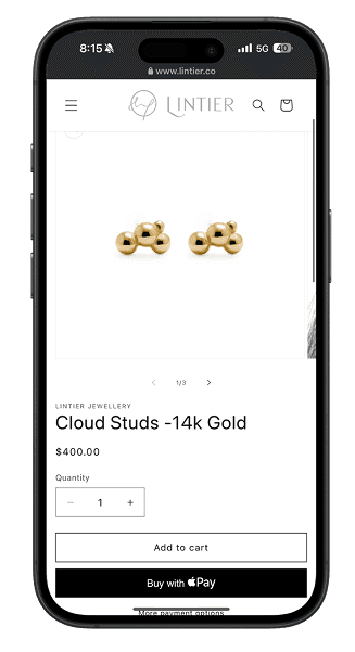
Let’s ditch Shop Pay and integrate Apple Pay for iOS users.
This was a strategic decision rooted in the research findings:
Eliminating Friction: It removes the need to create or log into a new account.
Leveraging a Native Experience: It uses the device’s built-in, trusted security (Face ID/Touch ID).
Efficient & Testable Solution: This single change allowed me to rapidly test my hypothesis without a costly redesign.


Validation & Iteration
Solving one problem, discovering another.
After deploying the high-impact fix, my focus turned to validation. I monitored the site for immediate quantitative results while also initiating informal user interviews to gather deeper qualitative feedback.
Immediate Validation
Making the First Conversion
The change had an immediate and definitive impact. Just 14 days after the new checkout went live, the site secured its first-ever online sale.
This was crucial quantitative proof that the payment friction had been the primary conversion blocker. The initial hypothesis was officially validated by a real transaction.

Qualitative Feedback
Uncovering the Next Challenge
With the core usability problem solved and the first sale secured, the user interviews were designed to uncover the next layer of challenges—those related to brand perception rather than functionality.


Founder Interview
Defining the next challenge.
With user interviews highlighting challenges in brand perception, the focus shifted from product functionality to brand strategy.
To address this, I conducted an in-depth interview with the founder to understand the core brand vision, value proposition, and the unique aspects of the handmade jewelry industry.
In order to facilitate a richer and more candid discussion, the questionnaire was prepared in both English and the founder’s native language, Chinese.

Proposed Iterations
Building brand trust through design.
Building brand trust based on the qualitative feedback, I proposed a series of strategic design iterations to evolve the website from a storefront into a trusted brand experience.
The proposal included redesigning the homepage to tell the maker’s message, showcasing craftsmanship on product pages, and implementing social proof like customer reviews.


Marketing Integration
Nurturing potential customers for long-term growth.
With the new website, the focus shifted to proactive growth. I integrated an email marketing system to capture leads via an automated 2-step email reminder sequence. This strategy works to convert immediate sales while building a valuable email list for future campaigns.

Outcome & Impact
From $0 to a Profitable Business
The targeted UX upgrade produced immediate and significant results, transforming a storefront website into a brand experience.

Reflection & Next Step
A roadmap for continued growth.
This project was a valuable lesson in using data to make focused, high-impact decisions. This core learning directly informs the next steps for the brand.
Key Learning: Focus on the Biggest Blocker
Instead of pursuing a costly and time-consuming redesign, I identified the single point of highest friction and fixed it. This targeted, high-leverage approach is crucial when resources are limited, proving that the most effective solution is often the simplest and most focused one.
Next Step: Measure and Optimize the Funnel
Now that a sales baseline is established, the top priority is to gather more data over time. This would allow us to accurately measure the specific reduction in checkout abandonment and A/B test new ideas. Analyzing the performance of the email marketing campaigns and the website’s usability together will be key to optimizing the entire customer journey for long-term, sustainable growth.
Next Project

TVO CMS Internal Tool Productivity Upgrade
Redesigned content management workflows for TVO’s Product Team.